Client:
Type:
Year:
Marché Publics de Montréal
Packaging
2025

Spices of Montreal
context
Marchés publics de Montréal is a non-profit organization managing a network of public markets with a mission to improve access to fresh produce, growers, retailers, restaurateurs and agri-food artisans.


brief
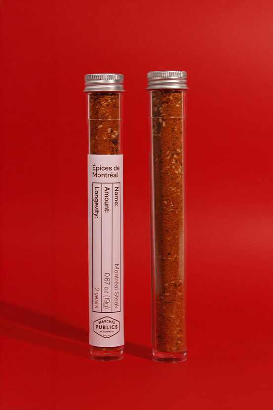
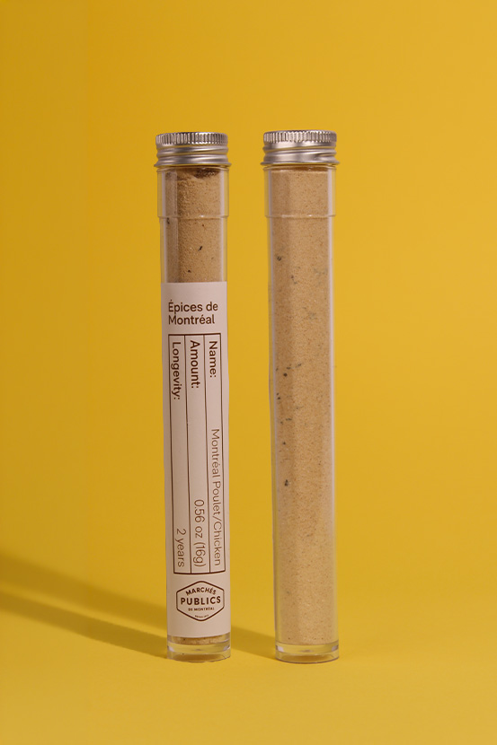
MPM is introducing a new brand of spice mixes produced and grown locally to its market. I was tasked to develop a brand for a line extension that conveys its values, while also positioning it for a contemporary market.
My brief specified the importance in balancing storytelling and structure.
The project had to express terroir both visually and physically, creating a flexible system to allow product variations such as individual spices.
brief
MPM is introducing a new brand of spice mixes produced and grown locally to its market.
I was tasked to develop a brand for a line extension that conveys its values, while also positioning it for a contemporary market.
My brief specified the importance in balancing storytelling and structure. The project had to express terroir both visually and physically, creating a flexible system to allow product variations such as individual spices.
design making
Visually portraying the idea without necessarily resorting to cliché visuals was a challenge.
The concept had to be clear enough in its visuals, but also not something that is often seen in other packaging.
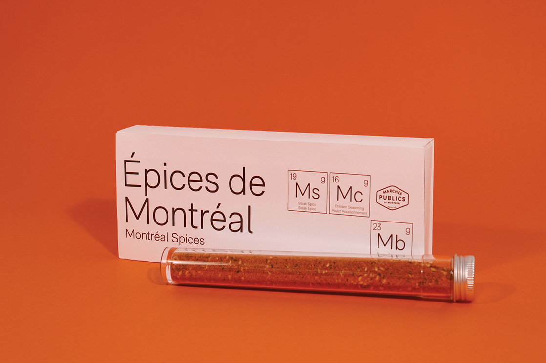
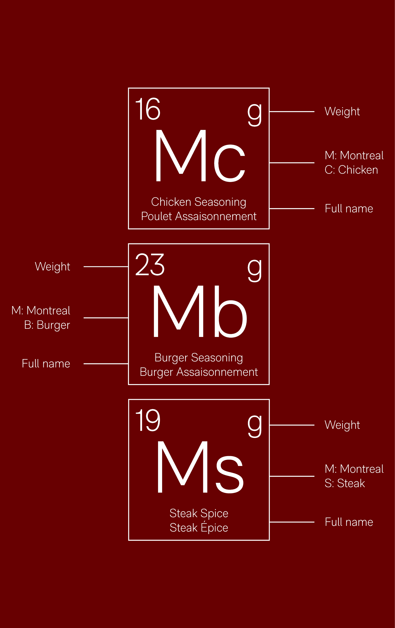
The first thing we learn when we first come across chemistry is the periodic table, so I thought it would be a good idea to incorporate that specific visual into a typographic approach for my packaging.
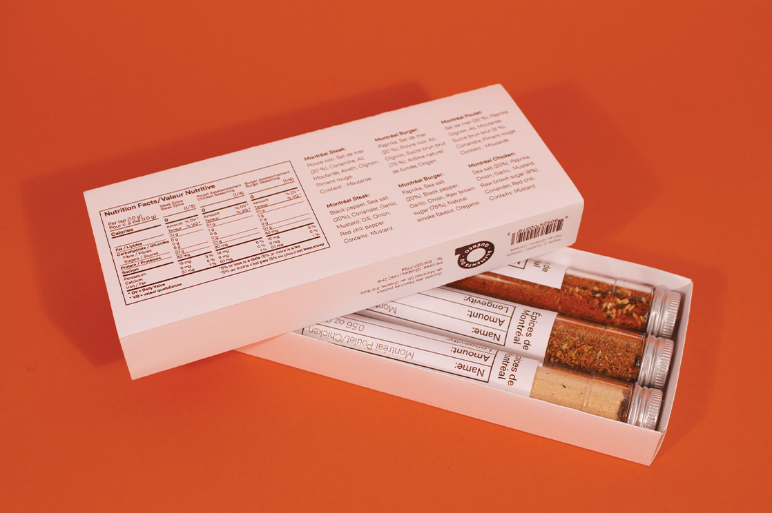
Some things had to be considered when working on the layout of my packaging. Firstly, my target audience is unlikely to buy a simple spice mix if sold by itself.
This means my packaging should not only be a system that contains more than one spice mix inside, but it also needs to be a system that could be expanded once other local spice mixes are introduced to the Montreal market.
The other element I had to be careful with is the visual I chose to represent this concept. The periodic table has an already known built system, and changes to that system could make it unrecognizable therefore cutting its link to the concept.
Simplicity was important for this design, so I used RM Neue as the only typeface. Variations of fonts were used–light, bold, and semi-bold–instead of using another typeface.
Colours were chosen after careful consideration of the different aspects in my packaging, the white background is reminiscent of the white background in the actual periodic table where as the dark brown (#522E1C) represents the soil where herbs grow.
The visual system for each spice is purely typographic. Each spice starts with the letter M (Montreal) to emphasize its local aspect.

bon appétit!
Credits
Typefaces:
Photography:
RM Neue Montreal by CoType Foundry
Aahd
Special thank you to Maya for overseeing this project as well as our technicians for all the help in printing.