Client:
Type:
Year:
Pivot
Branding
2026
Pivot
context
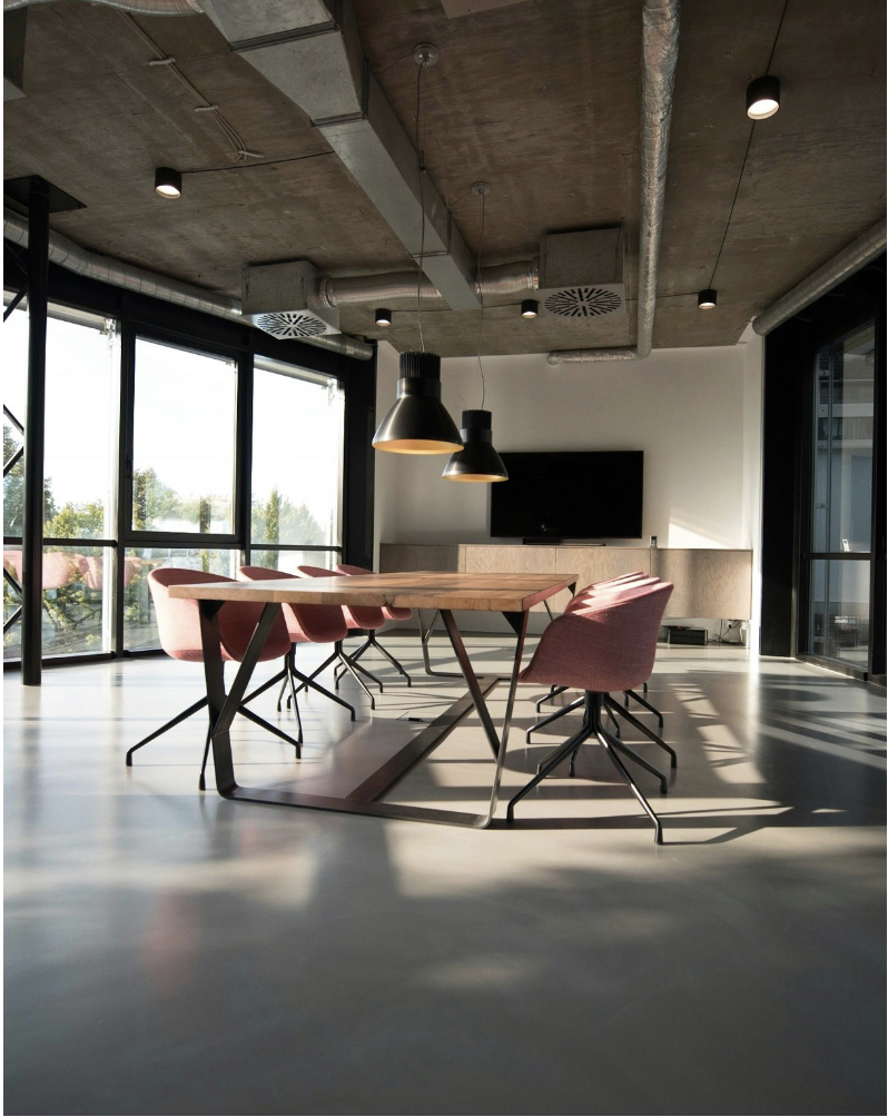
Pivot is Montreal's first architectural cooperative. It is structured as a worker cooperative in which responsibilities, resources, and decision-making are shared collectively among members.


brief
Pivot is looking to enhance their branding.
I was tasked to design and produce their new brand identity.
I had to create a brand identity that is both professional and cohesive with their practice.
The brief emphasized highlighting the qualities of the brand as well as the unique expertise of its members.

design thinking
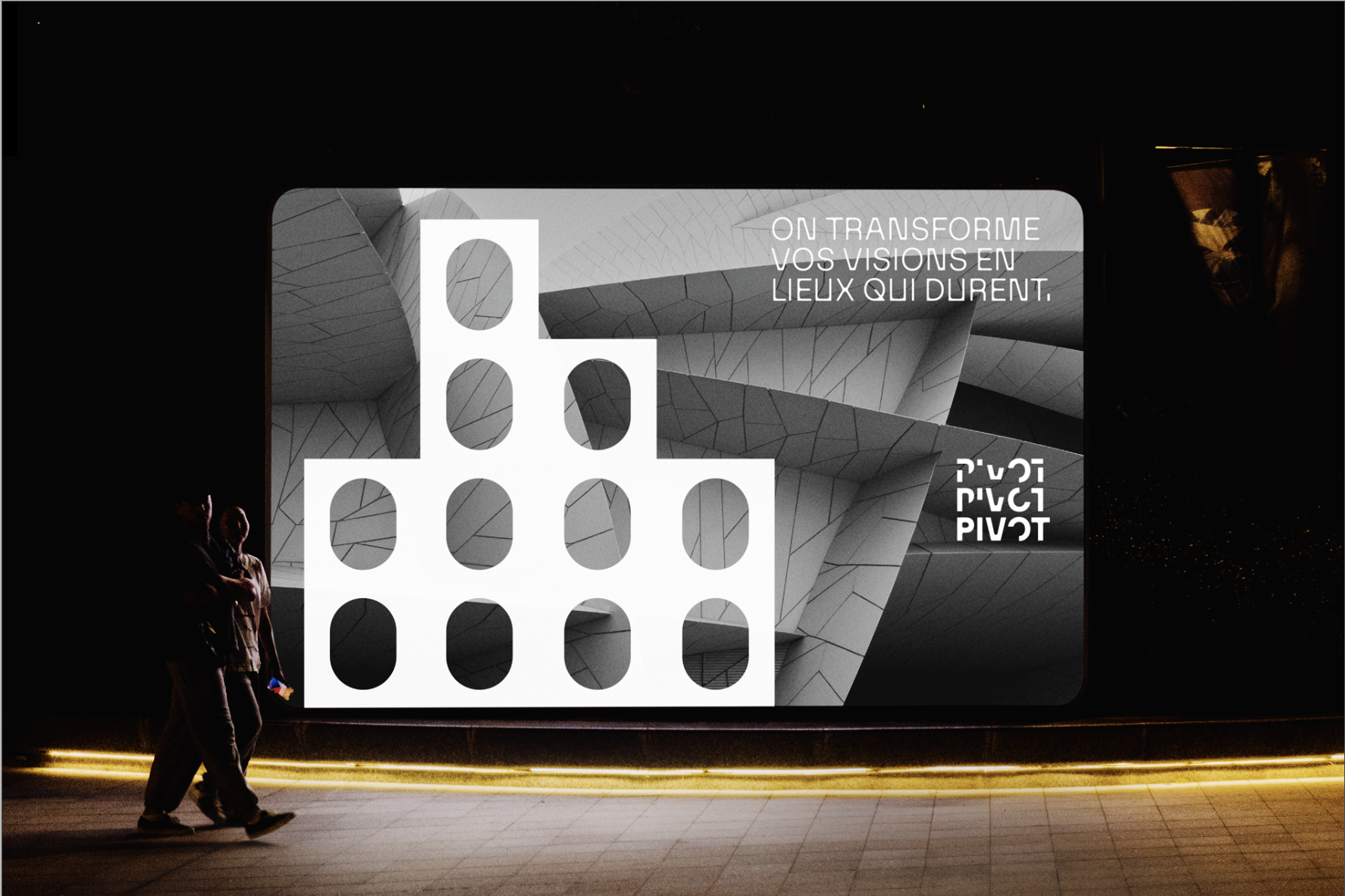
Because the brief emphasized creating a more professional brand identity, I explored different ways to introduce visual interest while working within a minimalist framework.
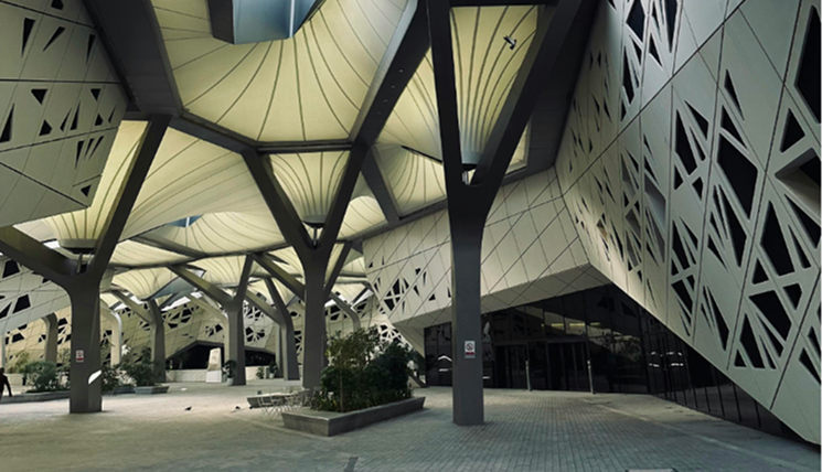
Through my research into architecture and cooperative practices, I was drawn to the concept of construction as both a visual and conceptual foundation.
Since architecture marks the beginning of a building’s development, I used this idea to reflect the cooperative’s role in shaping projects from initial concepts to finished spaces.

design making
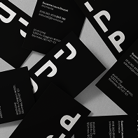
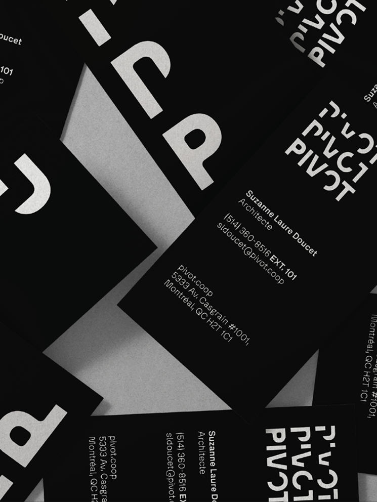
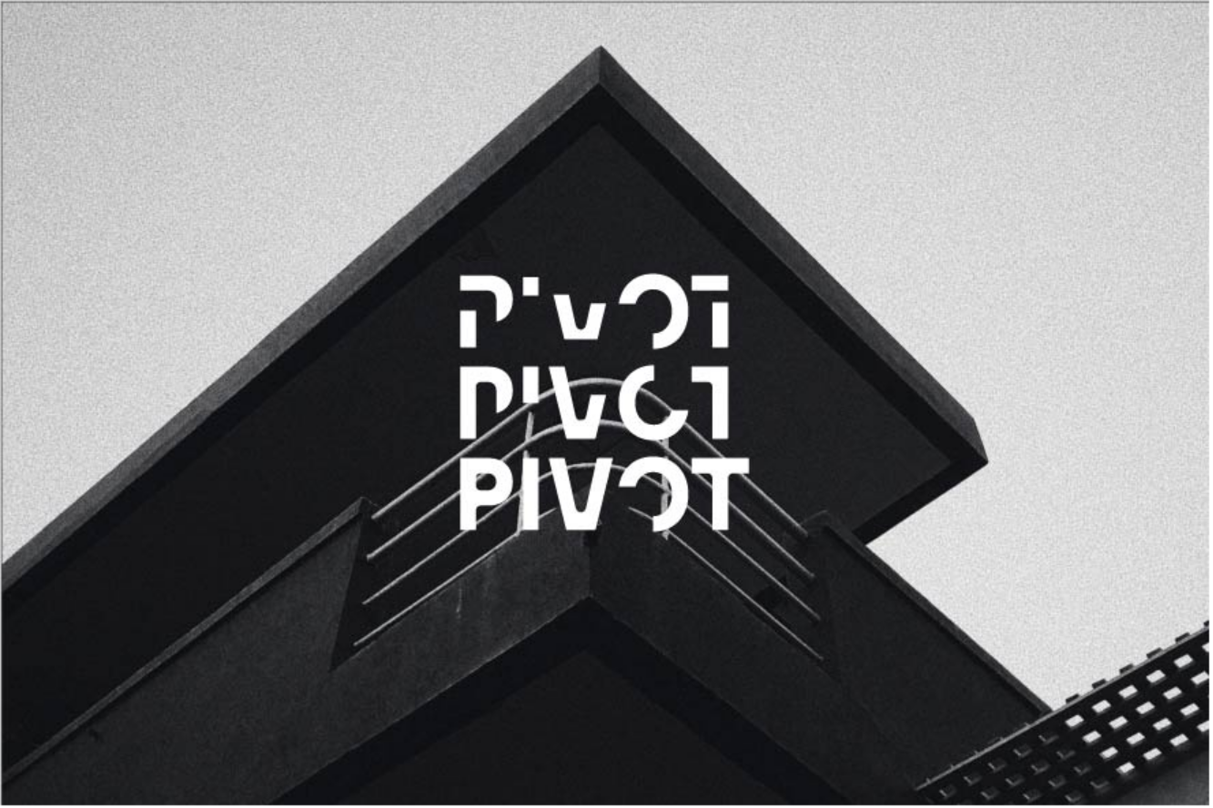
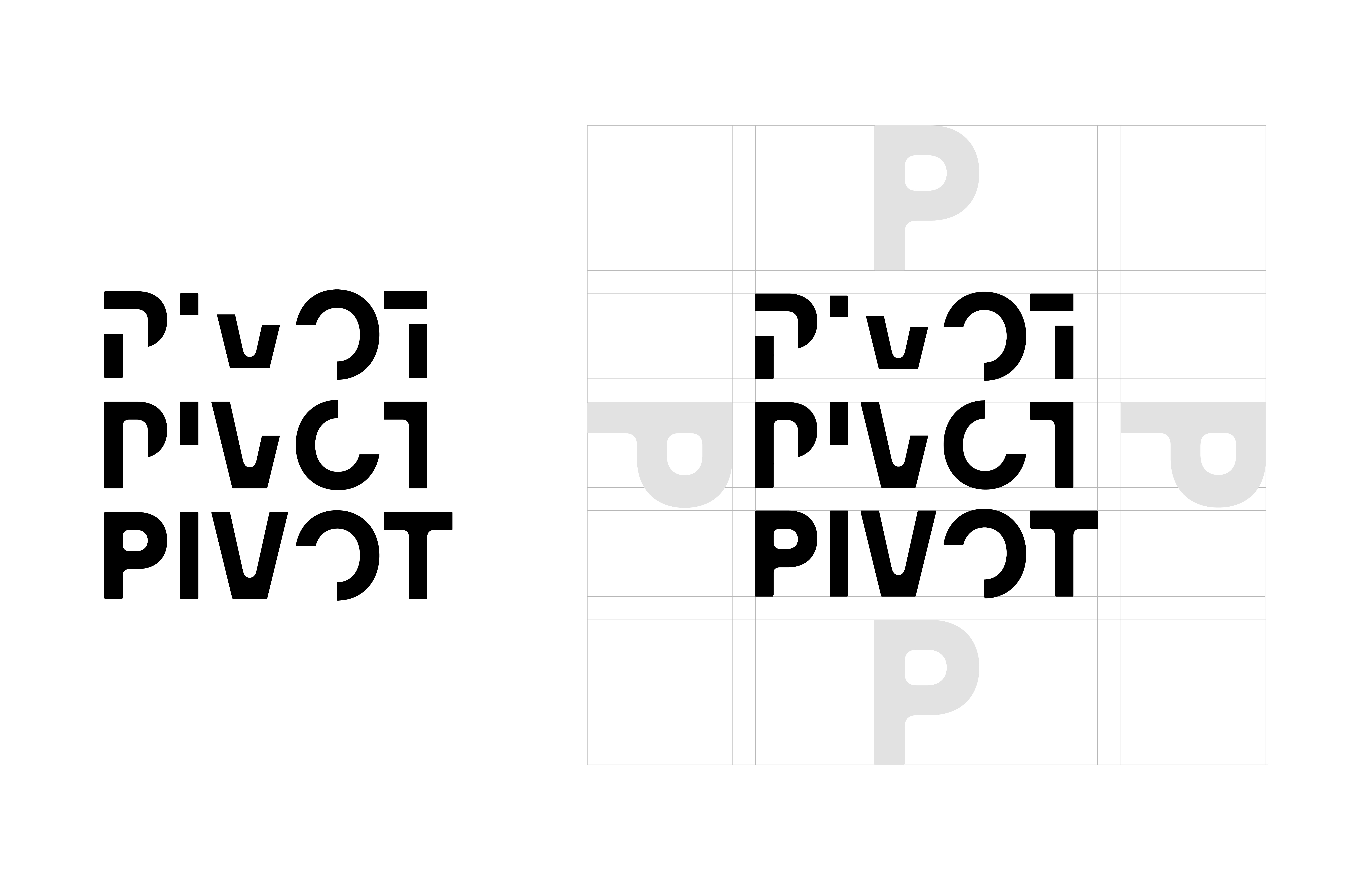
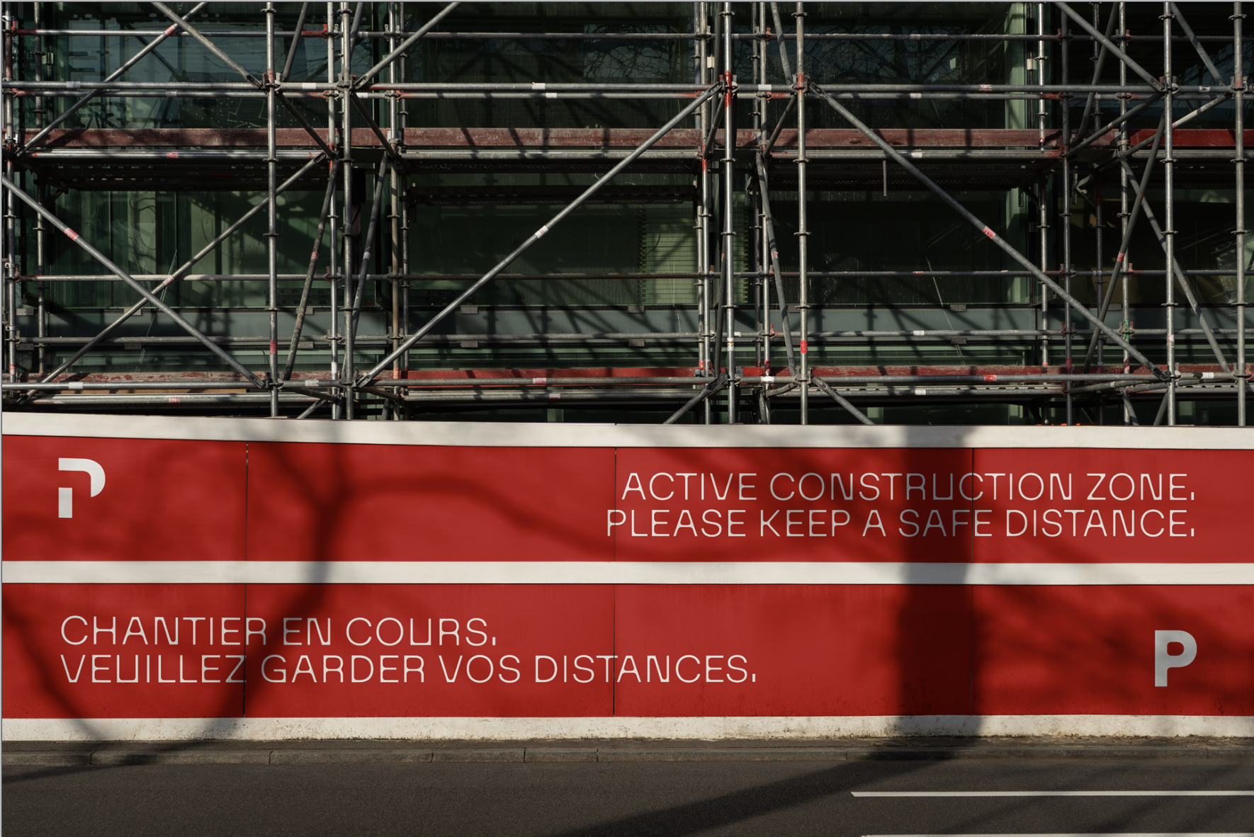
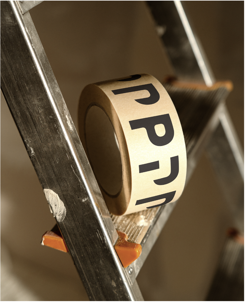
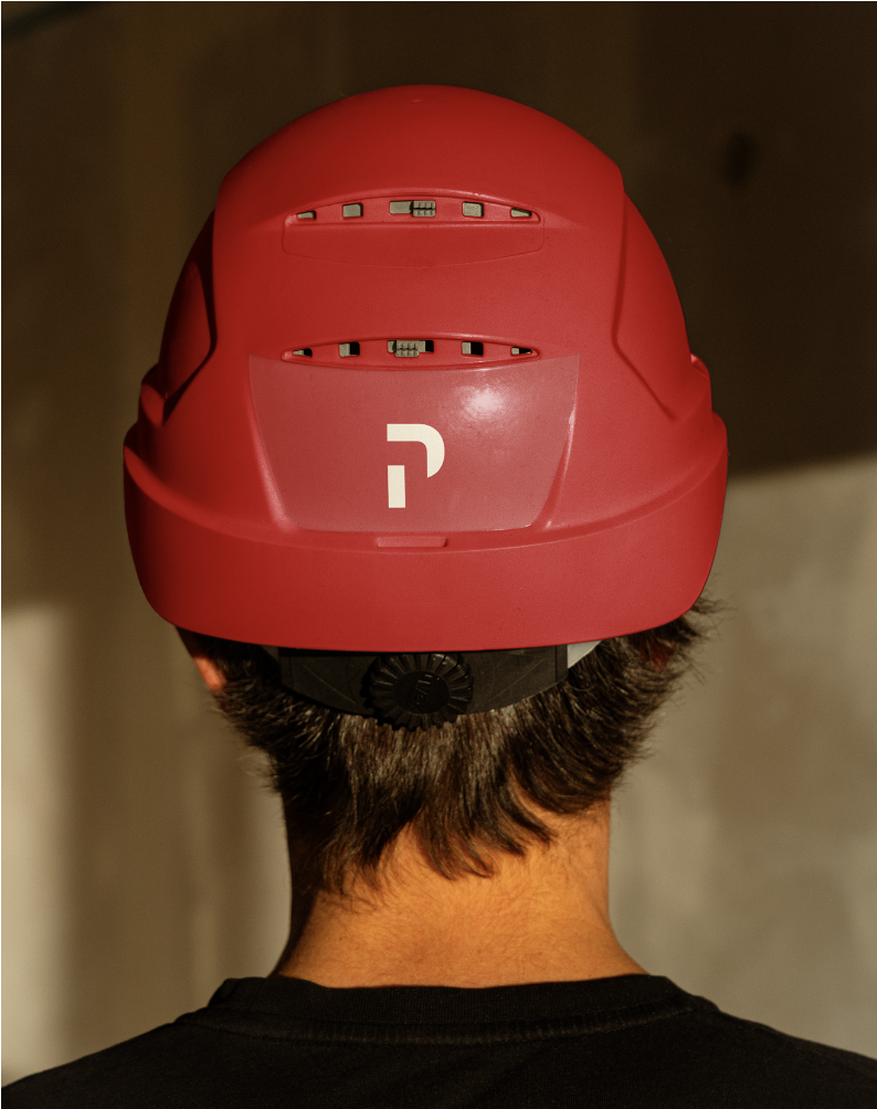
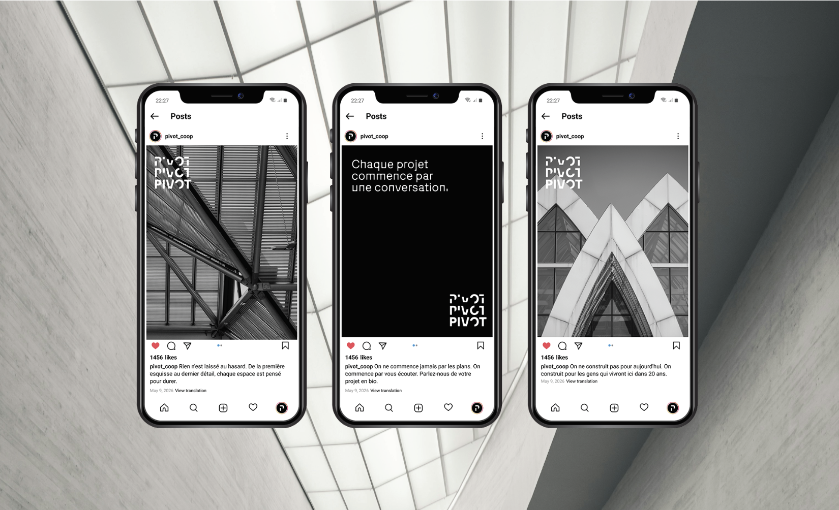
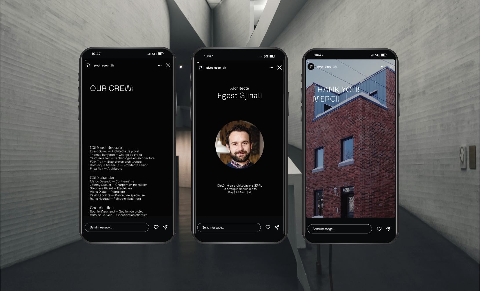
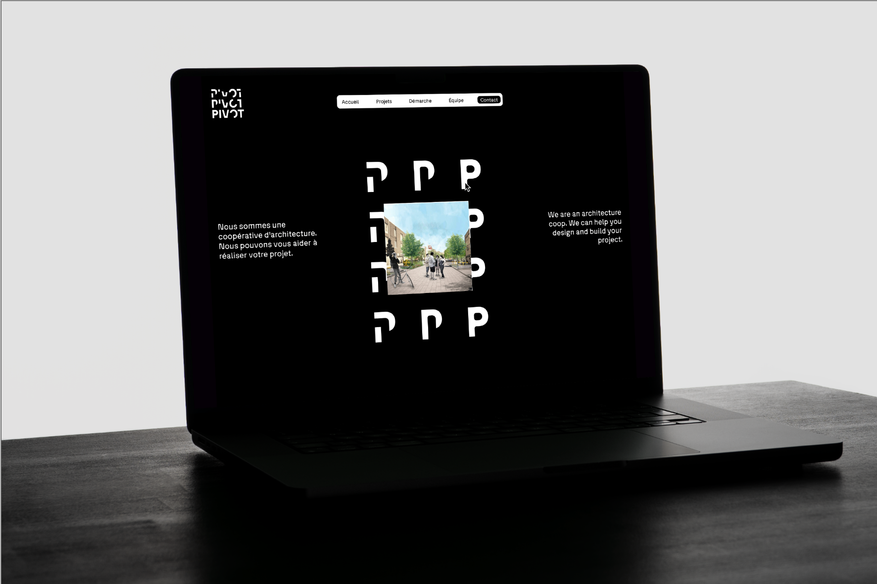
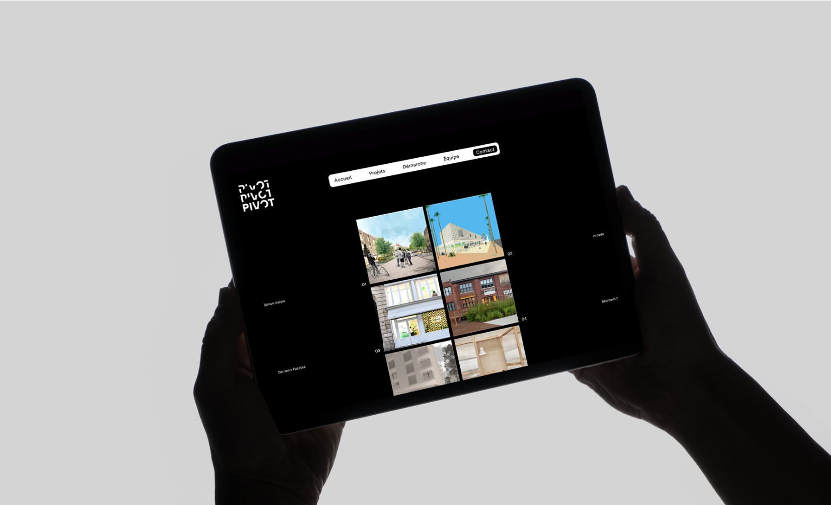
The logo system begins in a deconstructed state, representing ideas in their earliest form. It slowly evolves into a refined and complete identity, mirroring the progression of the architectural process, from concept and planning to structure and realization.
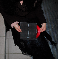
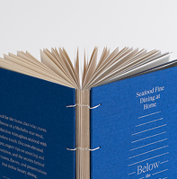
The final identity system was developed through a minimalist and structured visual approach that reflects both professionalism and the collaborative nature of the architecture cooperative.
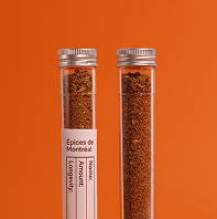
The visual identity uses a restrained colour palette to maintain a professional and timeless appearance. Neutral tones were prioritized to emphasize simplicity and allow the form, composition, and motion of the identity system to become the main focus.
The logo system was designed to evolve through different stages of deconstruction and refinement. Fragmented graphic elements represent ideas in their conceptual phase before gradually forming a complete and recognizable mark.
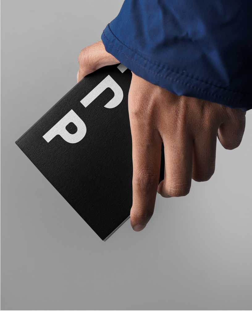
Graphic elements and image treatments were kept minimal to support the overall concept without overwhelming the system. The identity relies on structure, pacing, and transformation to communicate its narrative rather than decorative visuals.

bonne visite!
Credits
Typefaces:
Photography:
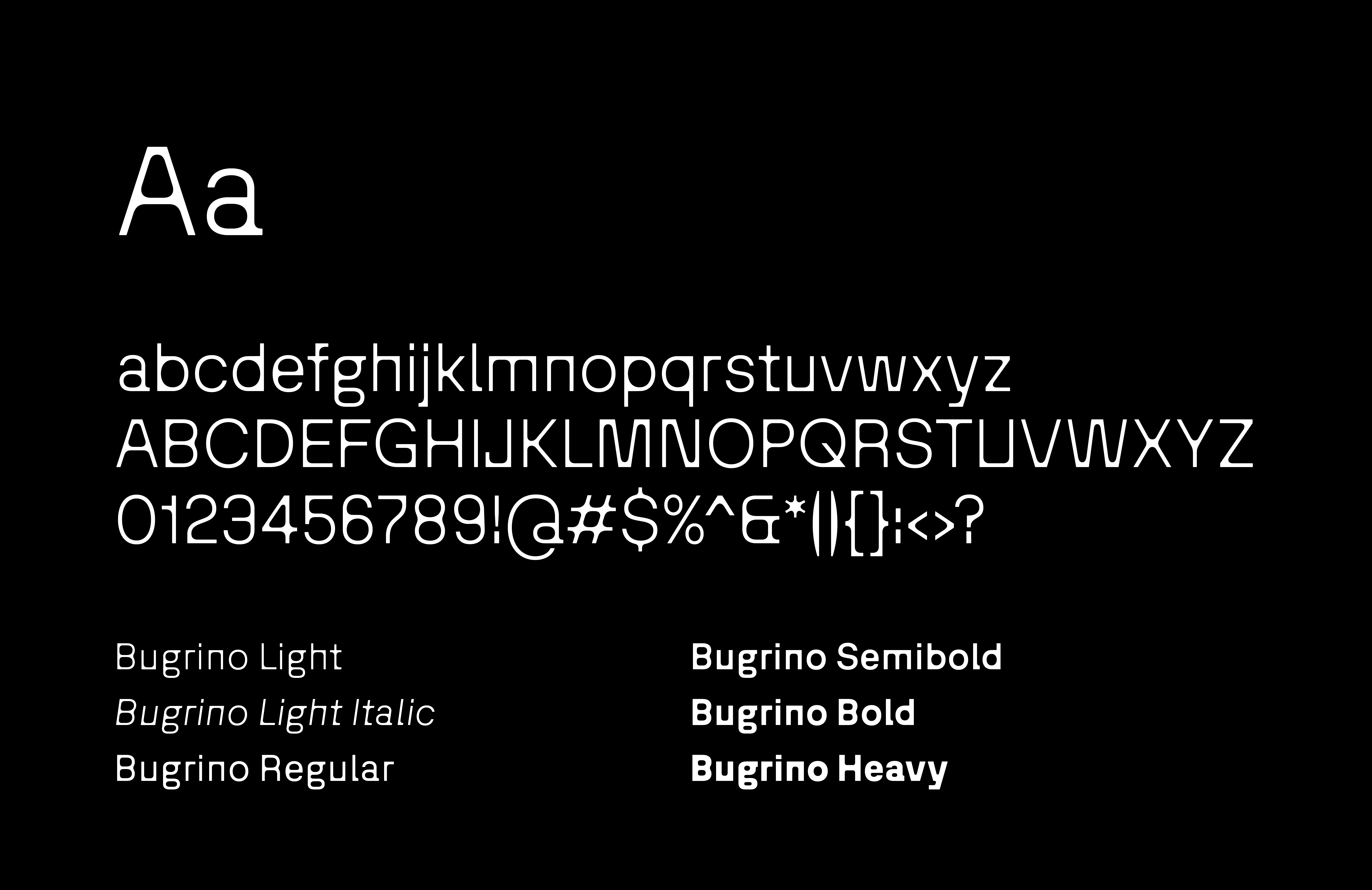
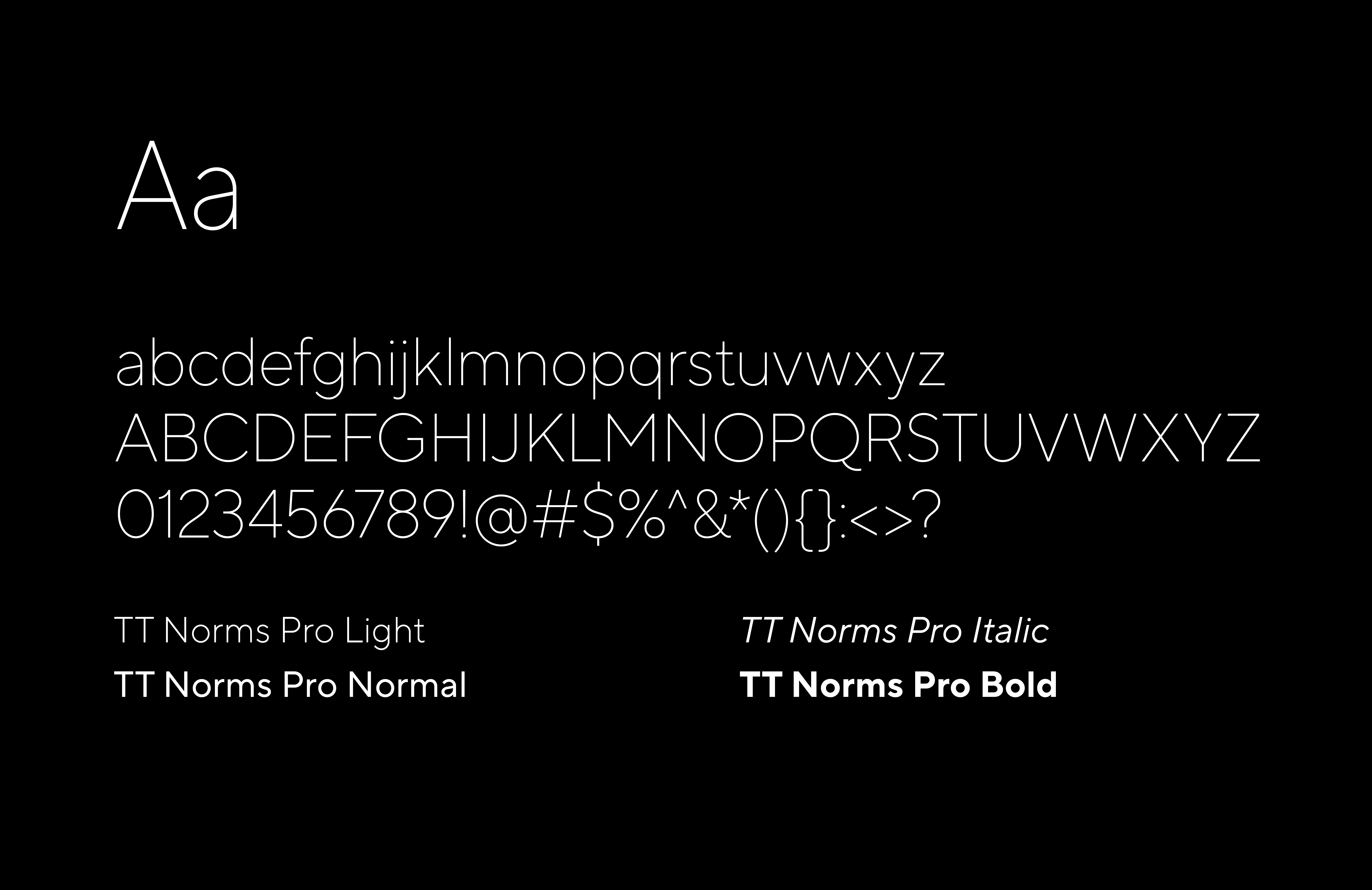
Bugrino by Studio Muhittin Güneş and TT Norms Pro by TypeType
Unsplash, Pexels
Special thank you to Marvin for overseeing this project as well as Tsar Print Shop for all the help in printing.