Client:
Type:
Year:
STM
Publication
2026

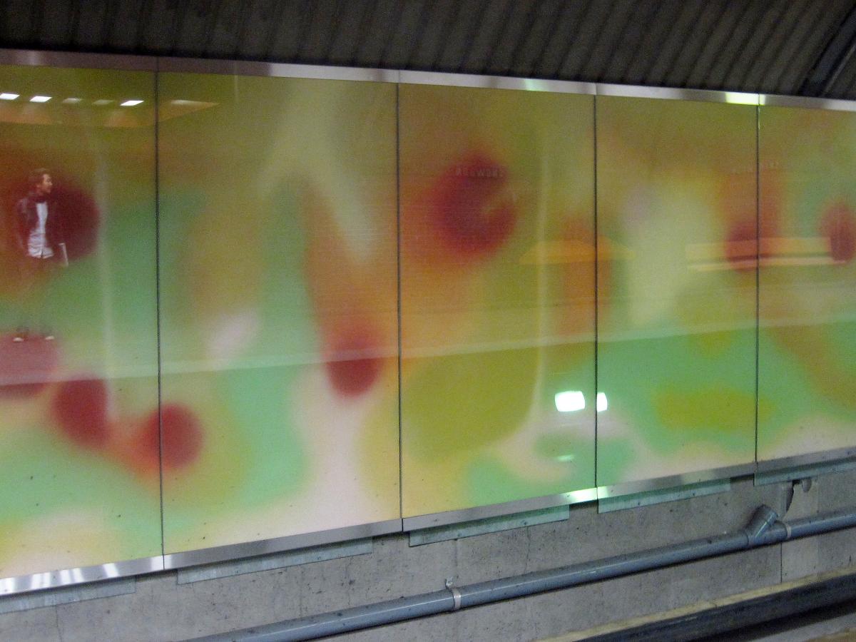
65 years of art in the metro
context
The Société de transport de Montréal (STM) is the public transportation agency responsible for operating Montréal’s metro and bus network.

brief
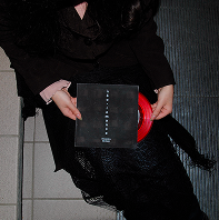
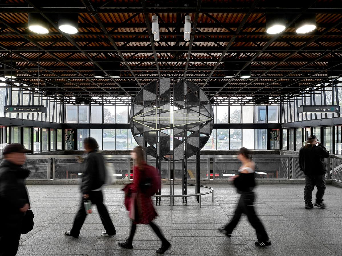
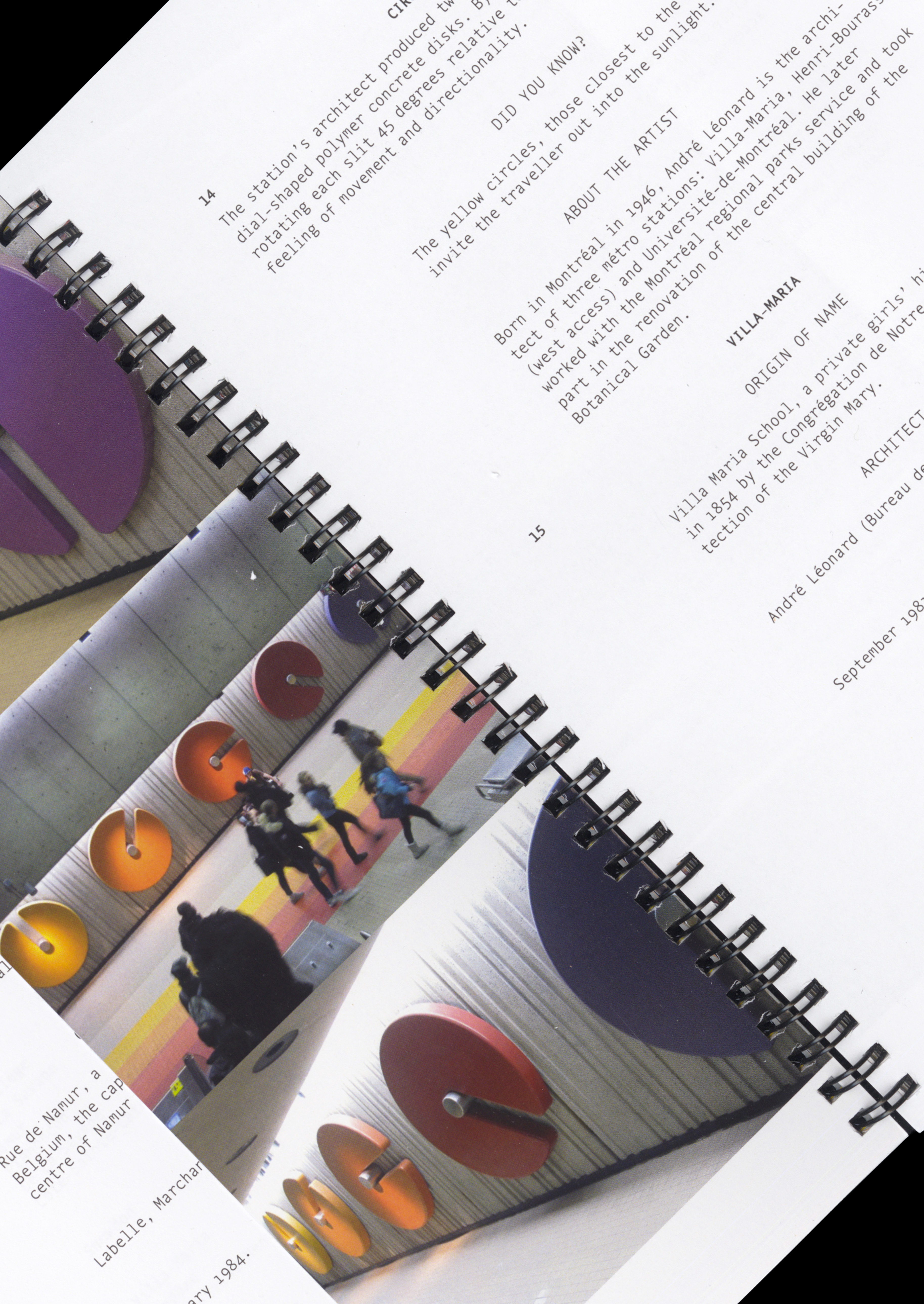
I was tasked to design and produce a brochure highlighting the artwork present throughout the STM network.
I had to develop an editorial publication that balances all elements while still focusing on the work itself.
design thinking
I thought of a few ways of approaching this project. I decided to make it more informational in an archival way than a regular brochure.
Because I had to create something that highlights work done in the past, I wanted the feeling of the brochure to be akin to documentary work.


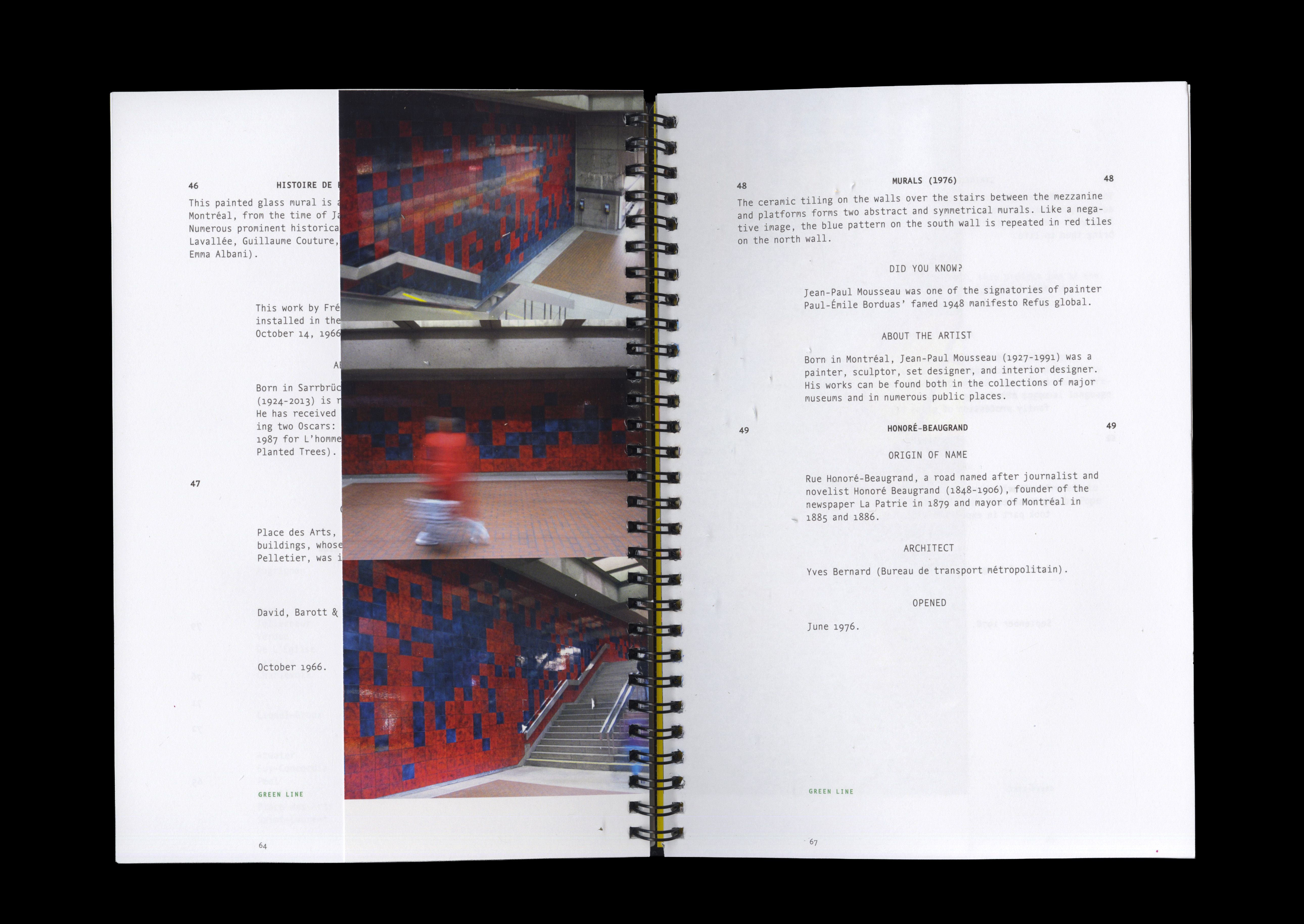


design making
Keeping the focus on the artwork rather than the layout was a challenge.
Because I decided to create something more archival, I thought of different ways of approaching it.
The idea that felt the most visually interesting without taking away from the work was to create something similar to a script for a documentary.
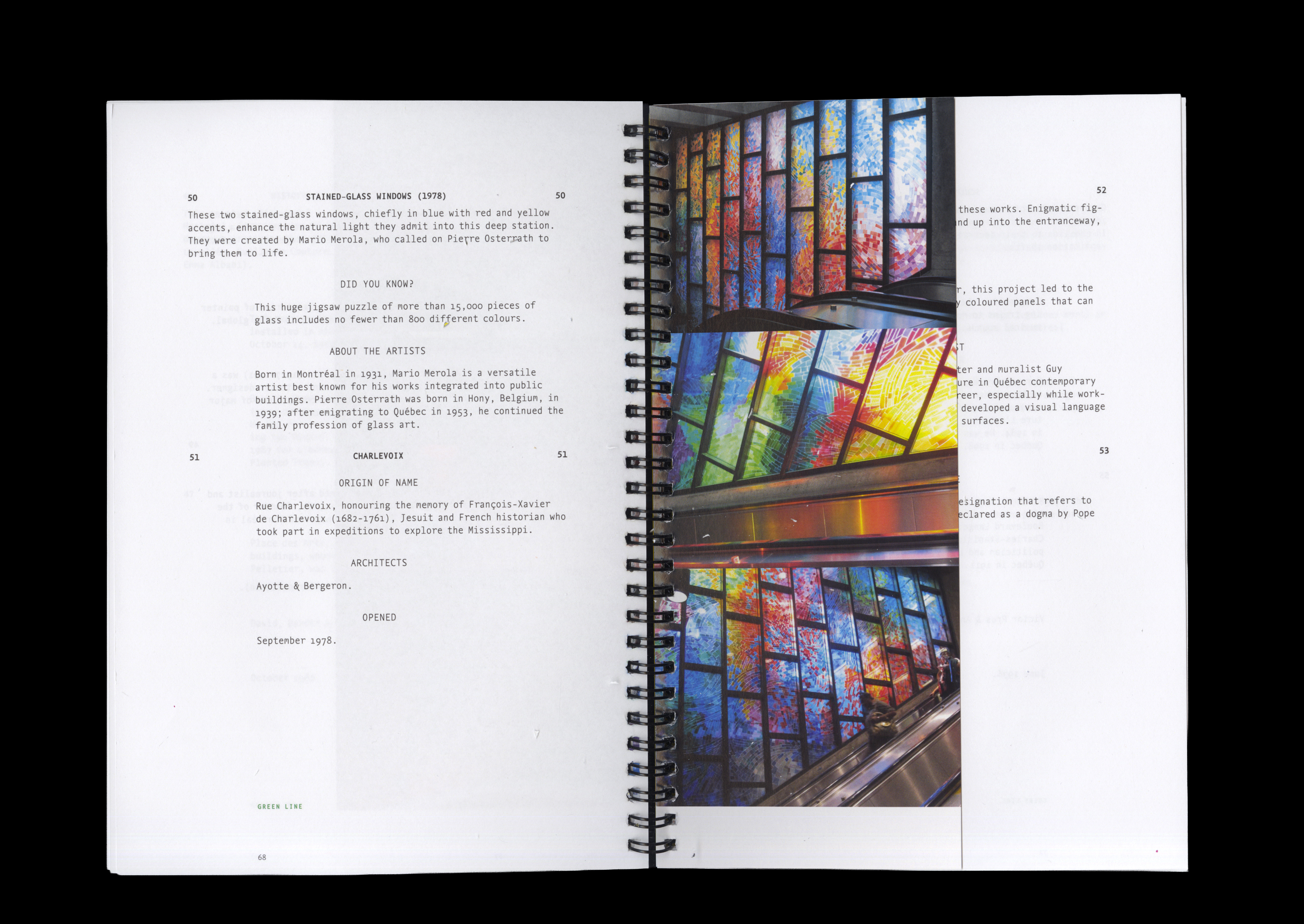
The layout was inspired by real life scripts and the typeface serves to emphasize the concepts without being too obvious. The type was worked on carefully, as it was originally a mono typeface. The goal was to still keep it modern despite the archival concept.
To emphasize the artwork itself, I decided to put the images into a different format. While the pages with types are full size (7"), the pages with photography are past half the original size (4").
This distinction allows for a different feel of browsing through the brochure, letting people enjoy both the photography as well as find it interesting to read the text.
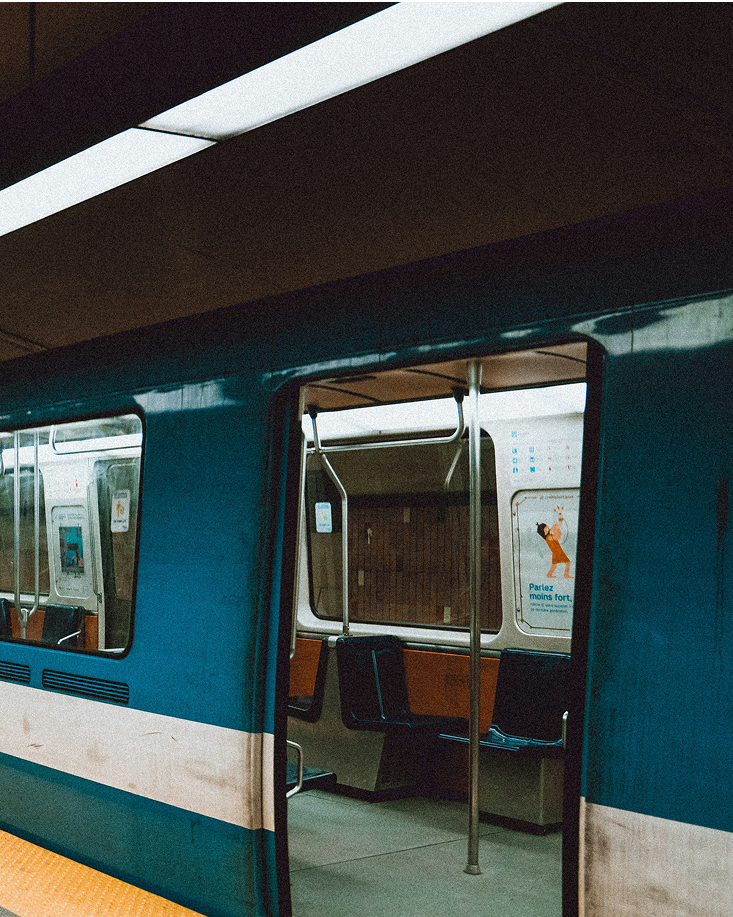
bonne route!
Credits
Typefaces:
Photography:
Nexus Typewriter by Martin Majoor
STM Website, Christopher Forsyth
Special thank you to François for overseeing this project as well as Tsar Print Shop for all the help in printing.
Other projects