Client:
Type:
Year:
Alexandra Stréliski
Promotion
2025

Néo-Romance
context
Alexandra Stréliski is a Montréal-born pianist. Her album Néo-Romance features cinematic piano compositions rooted in emotion, nature, and nostalgia.
brief
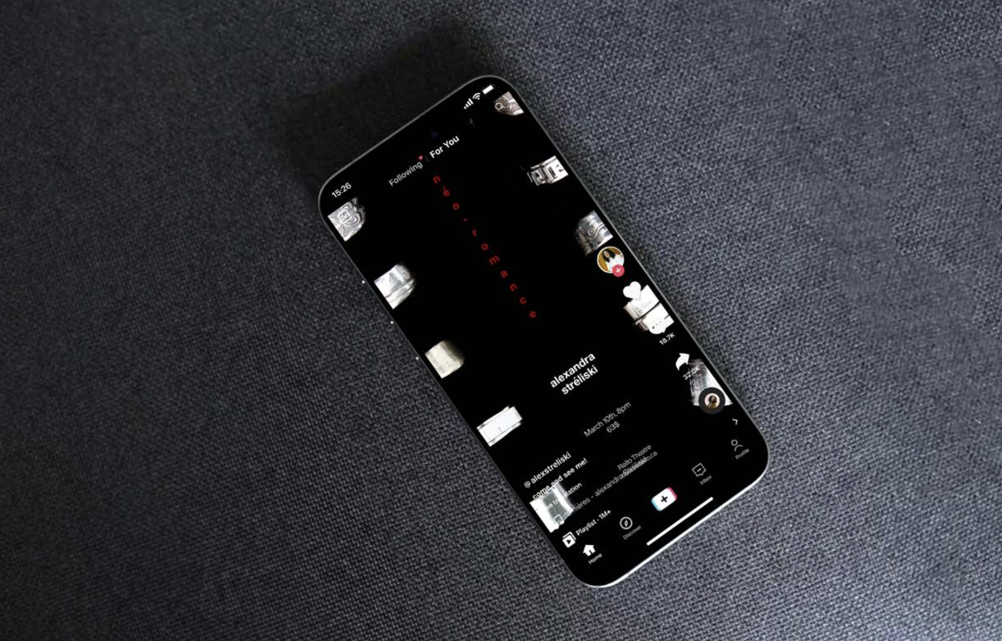
Alexandra Stréliski released a new album called Néo-romance, and she is now touring.
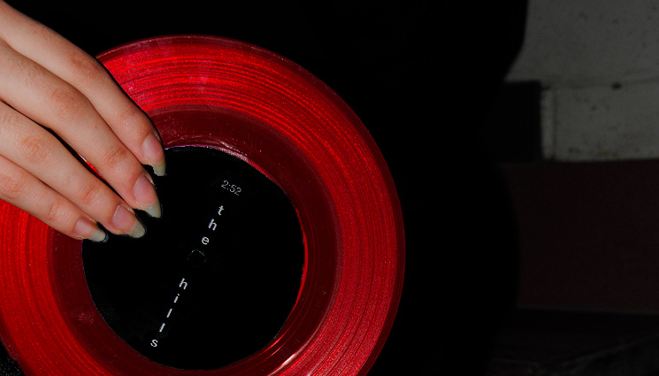
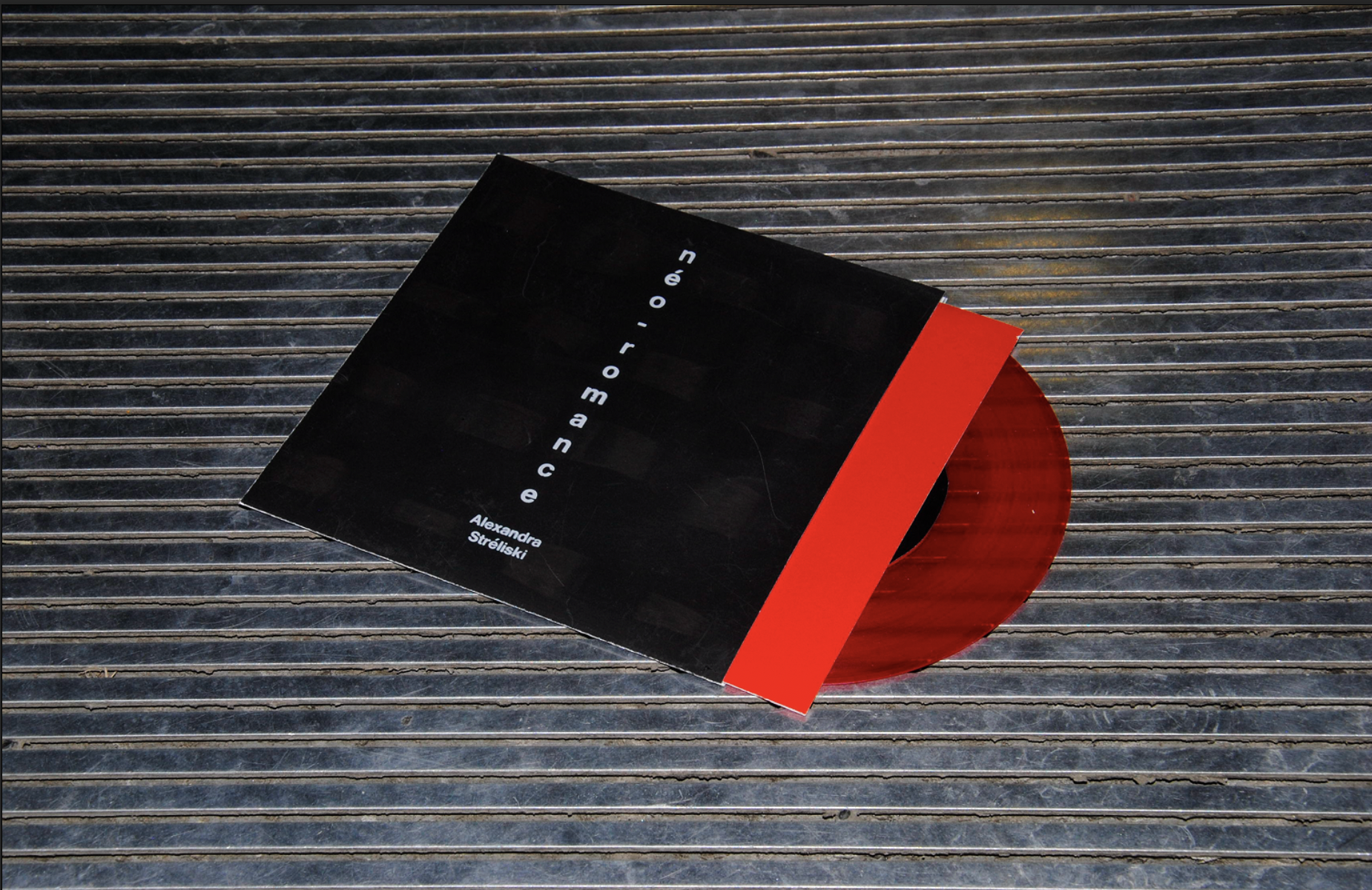
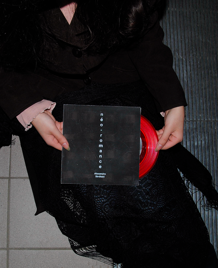
I was tasked to design and produce the promotional material for a concert and adapt the design of the music poster to create a vinyl record.
I had to create a material that was intriguing in order to capture the attention and encourage attendance to the concert.
The brief emphasized the importance of conceptual and aesthetic appeal as well as typographic hierarchy.

design thinking
Listening to the album as someone who enjoys music was an out of body experience. I quickly realized that Alexandra Stréliski is truly someone who knows how to evoke emotions in her listeners with her piano notes.
I considered a few aspects when exploring what kind of poster I can create at first. It was a choice between representing the sounds of the album or representing Alexandra Stréliski as the composer.
Because it had to be more intriguing, I tried to learn as much as possible on Alexandra Stréliski’s process in creating her music, and it ended up being what I wanted to highlight for her concert and vinyl record.
I wanted the target audience to feel more of her presence in the poster and vinyl than just her music.


design making
The final poster would not have seen the light of the day without the extensive research on Alexandra Stréliski and the hours spent listening to her album Néo-Romance.
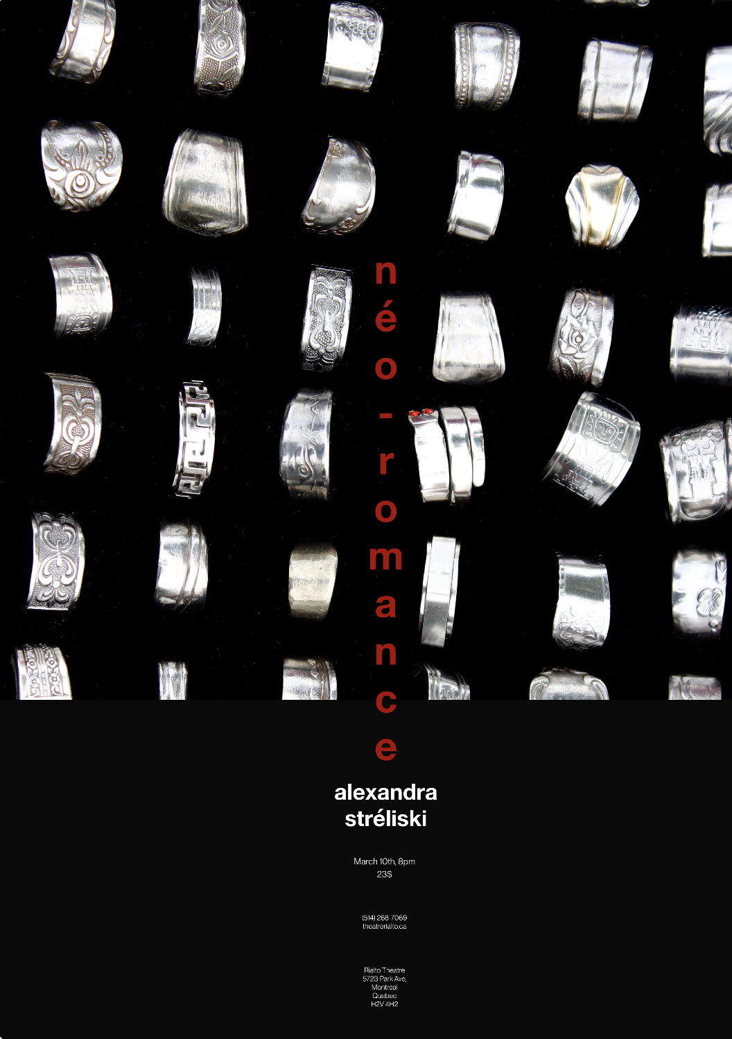
Directly based on her music and her person, the poster is inspired by the rhythmic cadence of the piano notes and the repetition of sound that can often be found in classical music.
The few rings that seem to be displaced are a reflection of the rhythm break found in a classical album where the pace of the notes changes and turns into something less calm and more cinematic.
The image being the focal point of the poster reflects Alexandra Stréliski’s desire of letting her music represent her audience’s feelings. By researching more about her persona, I also found that she is someone who writes music with spontaneity.
The poster was inspired by Stréliski’s notion of rawness, of putting her emotions bare for the world to see and hear. After the creation of the promotional poster, I focused on adapting the design to the vinyl record.
The poster has rings as its main element, so I researched how to adapt both the visual element as well as the concept behind it. I tried a few things before finding a special ink that I thought fitted the concept the best; thermochromatic ink.
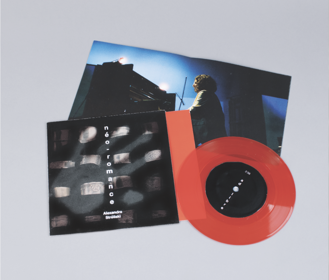
A ring is something people manipulate with their hands and the ones in the poster specifically are metallic, so I wanted the target audience to have this fun experience where they can directly interact with the outer sleeve of the vinyl record.
Thermochromatic ink is an ink that only reacts to a certain heat level. I chose one that reacts to the human palm’s hand which is what creates the interaction on the outer sleeve of the vinyl.
To create the sleeve, I firstly had to print the design that would be covered. I then screen-printed on top of it with the thermochromatic ink.
In order to get a darker effect, I had to do it twice as the ink can sometimes appear to be more transparent. The title of the album was then screen-printed on top of the thermochromatic ink.
bonne écoute!
Credits
Typefaces:
Photography:
Helvetica Neue by Linotype
Linna Kang & Aahd
Special thank you to Tania for overseeing this project, to Pierre-antoine for his help in screen printing the cover as well as our technicians for all the help in printing.