Client:
Type:
Year:
Phaidom Books
Publication
2025

Below the Surface
context
Below the Surface is a cookbook exploring the delicacies of the ocean. Featuring medium to advanced seafood recipes, it's designed for skilled home cooks looking to recreate the fine-dining experience.
brief
The mandate for this project was to design and produce a seafood cookbook combining typography, publication design, and original illustrations to create an engaging cookbook.
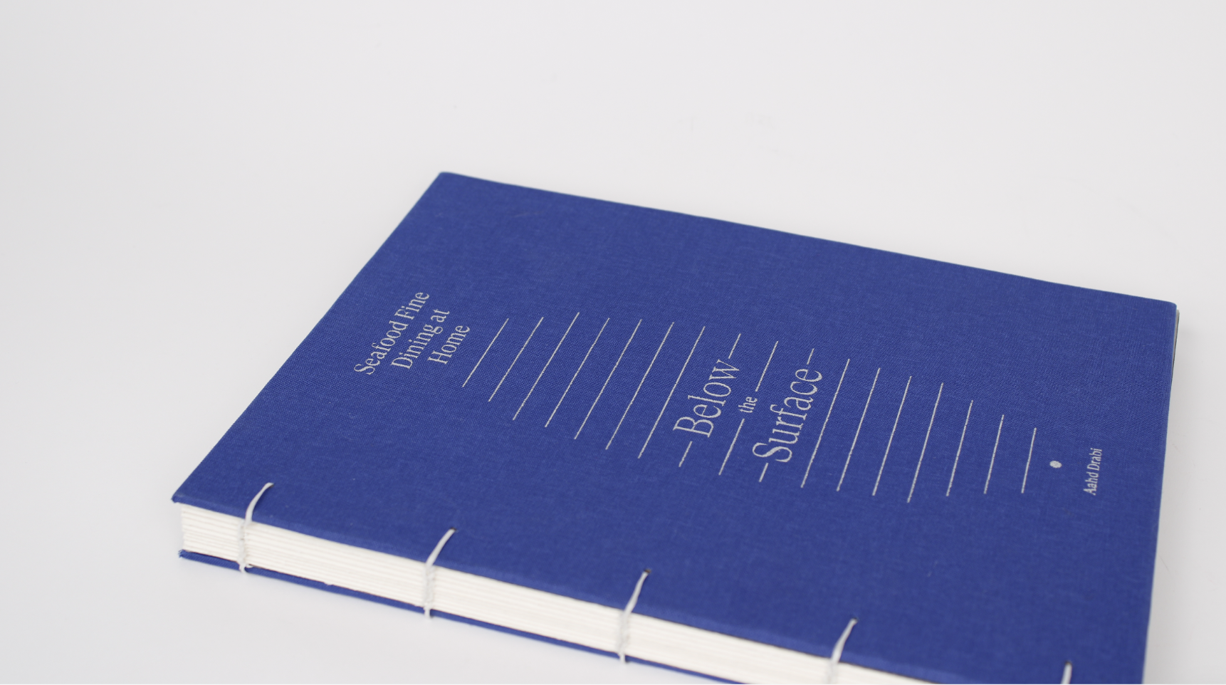
From the content of the book and the mandate, I already knew from the start that the binding would be a little more intricate than regular binding, so I wanted to explore this direction while creating the cookbook.

design thinking
This cookbook targets people who know their way around the kitchen and do not hold back in terms of cuisine.
Their refined taste was an important aspect I kept in mind while designing Below the Surface. The content itself had a lot of elements ranging from the long list of ingredients, to the images, to the long instructions and to the plating tips at the end.
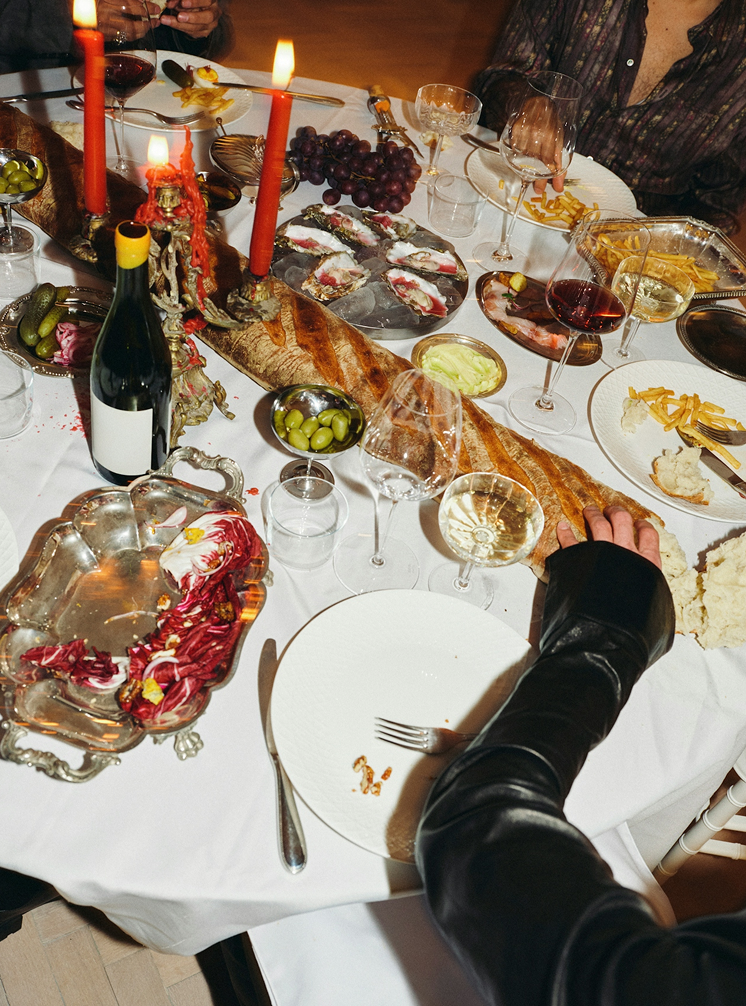
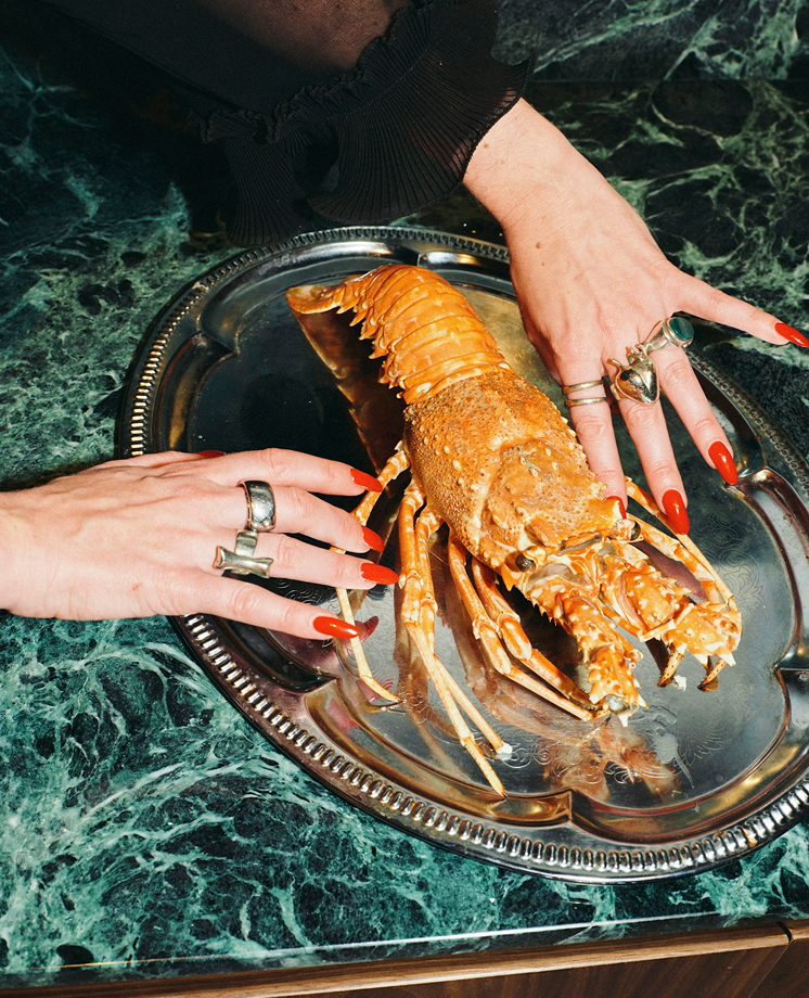
The photography was varied with some images being more experimental, and others being more literal. These were all things I had to keep in mind when coming up with layouts.
I also had to make sure that nothing was confusing for the reader as a small mishap can ruin a recipe.

design making
Finding the right layout and the right typefaces for the cookbook was important.
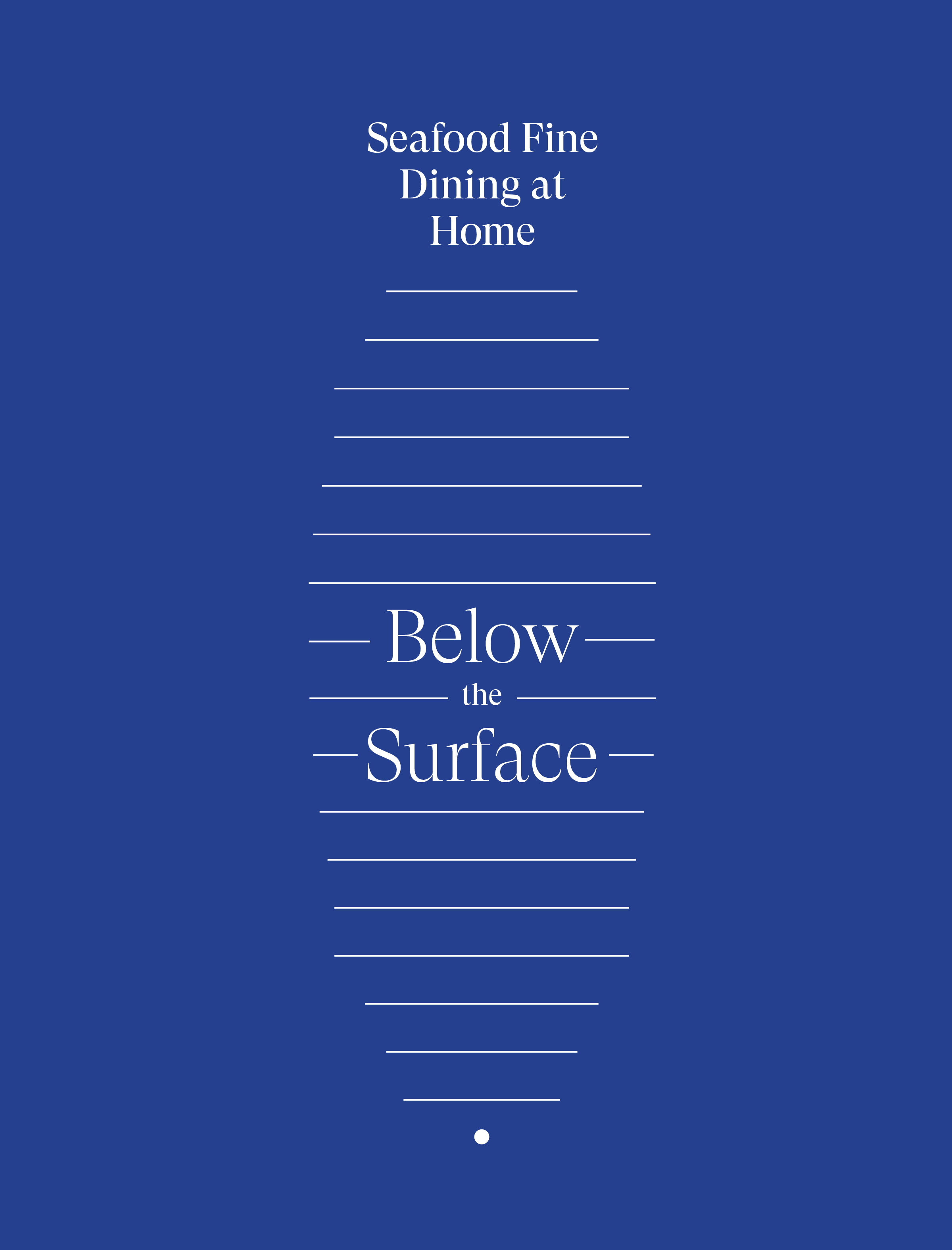
I chose Grilli Type’s GT Super Display and Mike Abbink, Bold Mondays’ IBM Plex Serif for their clean and refined letters.
These two typefaces reflected well on my target audience offering a more refined look to the recipes. Aside from the colour of the text being a simple black, the other colour used throughout the cookbook is a darker blue as a reflection of the ocean.
While the ocean is often represented by a lighter blue, I decided to represent the darkness of the ocean the divers see as some seafood comes from lower than what we are used to. I also used silver and reflective paper for the end-papers to reminisce of the fishing wires fishermen use.
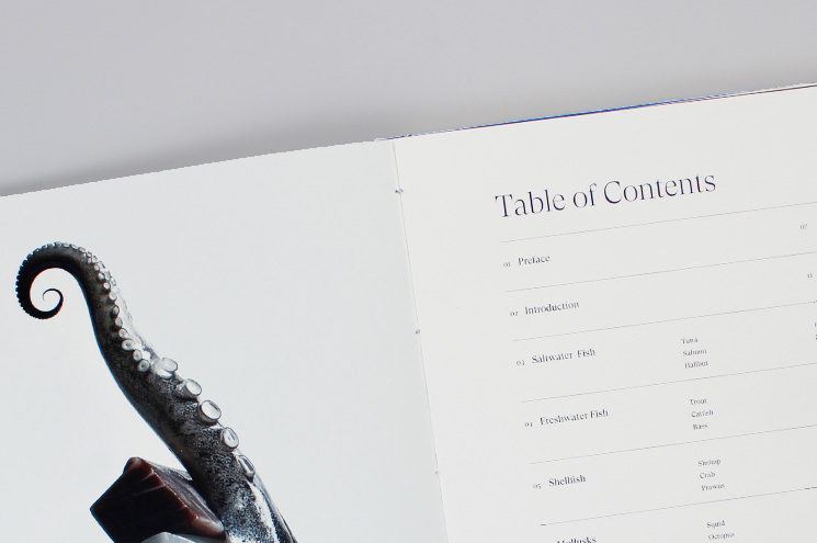
The large paragraphs of information had to be carefully split in different sections for the layout. It was also impossible to fit everything in one page, so I ended up splitting every element into two spreads where one only contains the information and the other only the photography.
Every block had its own information, so I also added fine lines of 0.25pt to create a structure and aid in the reading of the cookbook. Both pages of text follow a similar layout where one element sits at the top left intended to be read first before being followed by either the ingredients or the instructions.
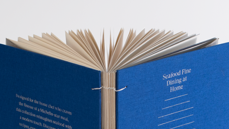
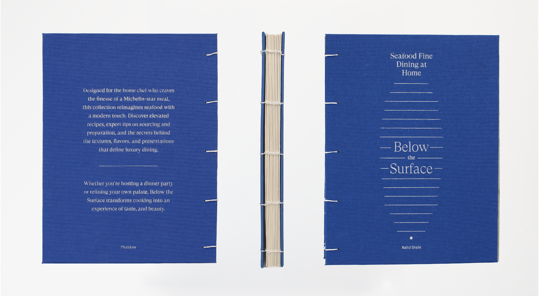
Considering this cookbook is not something that will be extremely mass produced, I was able to be more experimental for the cover where I chose to not only use a hard cover, but to also screen-print the design on a book cloth.
I decided on the binding after thinking of how the cookbook will be used. It is something people will want to have on their kitchen counter preferably able to fully open and it is also something they will want to display when not used. An exposed coptic binding fits both of the usage, so it is what I went with.
bon appétit!
Credits
Typefaces:
Photography:
Grilli Type’s GT Super Display and IBM’s IBM Plex Serif.
Aahd, Death to Stock
Special thank you to Tania for overseeing this project, to Pierre-Antoine for his help in screen printing the cover as well as Tsar Print Shop for all the help in printing.